Eyeshadow Colors: Undertone, Contrast, and Safety

Quick answer: Build an eyeshadow color plan from three decisions: the depth range, the amount of contrast, and the finish. Eye color and skin undertone can inform the palette, but lighting, placement, clothing, and personal preference matter more than a rigid complementary-color rule. This independent editorial guide does not claim first-hand product testing, diagnose, prescribe, or guarantee a result.
Choose the depth structure before the hue
A workable palette usually needs a light-to-deep relationship, not a prescribed number of pans. Decide which shade will be closest to the lid tone, which will create visible shape, and whether a deeper accent is needed. Very similar depths can produce a soft wash; larger depth contrast creates more definition.
Evaluate depth in a grayscale phone preview or by squinting at swatches under neutral light. This separates value from an exciting color name. A pale shimmer and pale matte may occupy the same depth even though they reflect light differently, while two browns can create strong contrast if one is much deeper.
Use undertone as a comparison tool
Warm, cool, neutral, olive, peach, and other undertone labels are broad descriptions rather than rules. Compare a candidate shadow with the skin, clothing, and other makeup under the same light. A warm copper may emphasize warmth; a cooler taupe may create contrast; either can work depending on the intended effect.
Do not assume that one undertone category forbids half the color wheel. Saturation and placement can matter as much as temperature. A small cool accent inside a mostly warm look behaves differently from a large opaque cool lid, and a neutral transition can connect colors that otherwise appear abrupt.
Treat eye color guidance as optional color theory
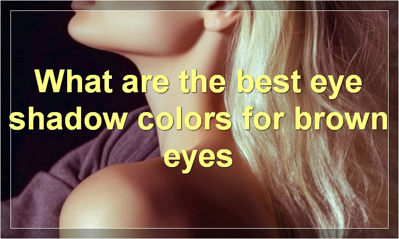
Complementary relationships can increase contrast: purples may contrast with green, warm coppers with blue, and blues or plums with warm brown. However, eye colors contain varied flecks and lighting changes their appearance. The same iris can support monochromatic, analogous, neutral, or contrasting approaches.
Choose whether the goal is to echo an iris tone, contrast it, or keep the attention on eyeliner, lips, or clothing. Test the color beside the eye rather than relying on a chart. No shade is inherently the most flattering for every brown, blue, green, gray, or hazel eye.
Coordinate with clothing without exact matching
Repeating one small clothing color in the eye look can create cohesion, but duplicating a bright outfit shade at full intensity may compete with the face. Consider undertone, saturation, and finish: a muted version, deeper relative, or metallic accent can reference the outfit without looking like a literal swatch.
For patterned clothing, select one secondary color or use neutrals that support the overall contrast. Check the complete look at conversational distance. An eyeshadow that is attractive in a close-up may dominate when combined with jewelry, neckline, glasses, and a strongly colored garment.
Assign finishes to specific visual jobs
Matte shadows absorb more light and can create apparent depth. Satin adds restrained reflection, shimmer emphasizes texture and movement, and glitter or metallic finishes produce stronger points of light. These effects vary with formula, particle size, skin texture, lighting, and application amount.
Place reflective products where light should be noticed rather than spreading them automatically across every zone. Use only products labeled for the intended eye area, especially when particles are involved. Cosmetic-grade marketing language does not override package warnings or regional restrictions on particular color additives.
Adapt placement to visible lid space
Map where the mobile lid, fold, brow area, inner corner, and lower lash line remain visible with the eyes open. Hooded, deep-set, prominent, monolid, and other structures change where color can be seen, but they do not require one corrective formula. Place depth and reflection according to the chosen open-eye effect.
Build color in thin layers and check both eyes from the front. Extending a shadow slightly above a fold may improve visibility, while keeping deep color close to the lashes can preserve openness. Stop blending when the intended edges are clear; endless blending can muddy distinct hues into one gray-brown field.
Test the palette in relevant lighting
Daylight, office LEDs, warm restaurant bulbs, stage lighting, and flash photography can shift apparent hue and shine. Rehearse an event palette in at least one comparable environment. Photograph without a beauty filter and inspect whether reflective particles create unexpected glare or whether low-contrast colors disappear.
Also observe the look after normal facial movement. Creasing, fallout, and fading depend on skin preparation, product, placement, and conditions. Record what happened rather than turning one wear into a universal claim. Adjust one variable at a time so the effect of primer, tool, amount, or finish can be identified.
Keep palettes and tools hygienic
Use clean hands and applicators, avoid sharing eye cosmetics, and do not add saliva or water unless the label directs a specific mixing medium. Close packages after use and discard products with changed smell, texture, contamination, or expired label guidance. Do not use eye cosmetics during an active eye infection.
Remove shadow with a method intended for the eye area and avoid grinding fallout into the eye. Stop for persistent irritation, swelling, pain, discharge, or vision symptoms and seek appropriate care. This guide offers color-planning choices; it does not promise pigment intensity, fixed wear, or suitability for sensitive eyes.
Build a compact test palette
Before buying a large palette, identify one base or transition depth, one defining depth, and one accent finish that can create the intended looks. Check whether existing products already fill those roles. A smaller functional color set can make undertone and placement experiments easier to interpret and reduces duplicate shades that differ mostly in marketing names.
Record combinations, not isolated swatches
Photograph the useful three- or four-shade combination and note where each color was placed. A beautiful arm swatch does not show how the depths interact on the lid. Recording the complete arrangement makes future looks repeatable and reveals which apparently unusual shade is functioning as a transition, accent, or liner rather than as a full-lid color.
Related Beauty Supply Reviews guides
Editorial sources
- https://www.fda.gov/cosmetics/cosmetic-products/eye-cosmetic-safety
- https://www.fda.gov/cosmetics/cosmetic-products/makeup