
Eyeshadow for Green Eyes: Color and Placement Guide

Quick answer: Plum and burgundy can contrast green eyes, while bronze, copper, and taupe can emphasize warmth. Treat these as options and test placement and finish in real lighting. This independent editorial guide does not claim first-hand testing, does not diagnose or prescribe, and does not promise a particular result.
Choose contrast or harmony
Purple-red shades can create contrast, while olive, taupe, bronze, and copper can echo colors around the iris. Lighting, clothing, and surrounding makeup change the effect; no shade changes eye color.
Build a small functional palette
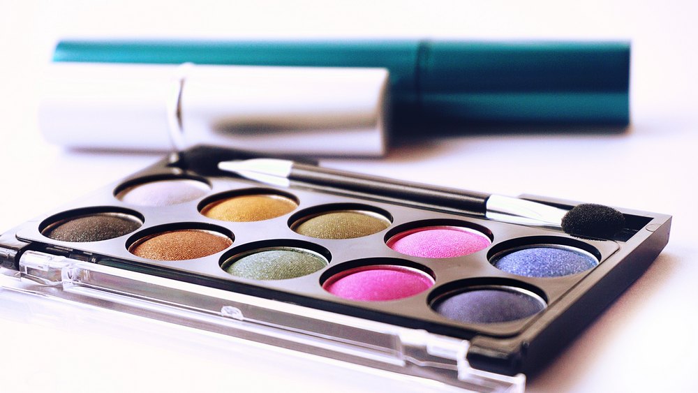
Use one lid color, a transition shade, optional depth, and a highlight only when it supports the look. A compact set with clear roles can be more useful than many similar shades.
Adapt placement to visible lid space
Map color with eyes open as well as closed. Hooded, deep-set, prominent, and monolid shapes reveal shadow differently. Keep the main shade where it remains visible in ordinary expression.
Keep eye products controlled
Use clean tools, close packages, and avoid shared products. Keep loose particles within labeled eye use and remove gently. Stop for significant irritation or vision symptoms.
Start with the effect, not a rigid color rule
Green eyes can include gray, blue, amber, brown, or gold areas, and surrounding colors shift with light. Decide whether the goal is soft definition, visible contrast, warmth, or an evening look. Plum is not mandatory and green shadow is not forbidden. The useful question is how a shade, depth, finish, and placement work together on the actual face.
Use plum and burgundy for controlled contrast
Muted plum, aubergine, wine, and burgundy sit near red-purple families that can contrast green. Begin with a low-saturation shade through the outer lid or lash line rather than a large opaque block. Some red pigments can make surrounding redness more noticeable, so compare the result with the complexion and choose a cooler brown-purple when a true burgundy overwhelms the look.
Use bronze, copper, and gold to emphasize warmth
Bronze and copper can echo amber flecks and create warmth without requiring a purple palette. Place shimmer on the movable lid where it catches light, then keep the crease matte if more structure is needed. Gold varies from pale yellow to deep antique tones; test it in daylight because highly reflective products can appear very different from a pan or online swatch.
Use taupe and brown for everyday definition
Taupe, mushroom, soft brown, and charcoal-brown can define the eye while keeping iris color central. Choose depth by the contrast wanted against skin and lashes, not by a universal day-to-night label. A small amount at the outer corner and lash line often creates more structure than covering the entire lid with one dark shade.
Place color for hooded or limited lid space
Map the design while looking straight ahead. On hooded eyes, place the transition and outer depth where they remain visible above the fold, then blend with the eye open. Keep shimmer below the mapped boundary when transfer is a concern. The broader green eye makeup guide can help coordinate this placement with liner, mascara, and complexion choices.
Adapt the method for monolids and deep-set eyes
On a monolid, a vertical gradient from lash line upward can preserve visible color without copying a crease that is not present. Deep-set eyes may need less dark pigment in the socket and more brightness on the lid. Prominent eyes can use matte depth selectively. These are starting frameworks, not corrections; eye shape does not need to be hidden or made to match a template.
Build depth in thin layers
Tap off excess, place the deepest color precisely, and blend its edge with a clean or lightly loaded brush. Repeat only if more depth is needed. Large amounts of powder create fallout and can muddy adjacent shades. A primer may change grip and saturation, so test the same sequence with the intended base before an important event.
Keep shimmer and glitter within labeled eye use
Not every decorative pigment is intended for the eye area. Check the current label, avoid craft glitter, and keep loose particles controlled. Metallic or sparkling shadow near the inner corner should not migrate into the eye. If a product causes persistent watering, burning, swelling, marked redness, or vision change, stop use and seek appropriate assessment rather than adding another product.
Choose liner that supports the shadow
Deep plum liner can extend contrast, bronze can maintain warmth, and brown can keep definition softer than black. Place liner according to visible lash line space and the desired shape. For an extended wing, use the cat-eye eyeshadow tutorial to map direction before adding dark pigment. Do not apply a product to the waterline unless it is labeled for that use.
Check the completed look in several lights
Bathroom lighting can flatten shimmer or shift burgundy toward brown. Review the result in daylight, ordinary indoor light, and camera light if photographs matter. Look straight ahead and from both sides. Adjust one element at a time: edge softness, lash-line depth, lid brightness, or color balance. More pigment is not automatically the solution when placement is the issue.
Clean brushes without damaging the eye area
Use clean hands and tools, do not share eye cosmetics, and close packages after use. Clean reusable brushes with a method suitable for the bristles and let them dry fully before they return to a closed container. Replace damaged applicators and discard products that change smell, texture, flow, or package integrity. Never add water or saliva to restore a dried formula.
Remove shadow with minimal friction
Use a remover labeled for the product and eye area, allow it time to loosen makeup, and wipe gently without scraping the lash line. Remove contact lenses according to professional guidance and product directions. Persistent residue is not a reason for hard rubbing. Stop if removal causes significant pain or irritation, and do not continue using a product that repeatedly creates symptoms.
Green-eye eyeshadow checklist
- The goal is contrast, warmth, definition, or evening depth.
- Shade is evaluated with skin, lashes, lighting, and iris variation.
- Placement remains visible on the actual eye shape.
- Depth is built in controlled layers with clean tools.
- Shimmer, glitter, and liner are labeled for the intended eye area.
- The look removes gently and does not cause persistent symptoms.
Editorial sources
- https://www.fda.gov/cosmetics/cosmetic-products/eye-cosmetic-safety
- https://www.fda.gov/cosmetics/cosmetic-products/makeup