Eyeshadow for Hazel Eyes: Color and Safety Guide

Quick answer: Hazel eyes can appear greener, browner, or more golden depending on light, clothing, and surrounding makeup. Purple and plum emphasize green contrast; bronze, copper, and gold echo warm flecks; olive and deep green create tonal depth. Use only eye-area-labeled products and clean tools. This guide does not claim first-hand testing or one universally flattering shade.
Identify the hazel balance in ordinary light
Look at the iris in indirect daylight without a color filter. Note whether the outer ring is green, gray, or brown; whether the center is amber; and which color dominates at conversation distance. A close flash photograph may show flecks that are not visible in normal settings.
Choose makeup for the effect you want, not for a rigid eye-color rule. The same hazel iris can look different beside warm clothing, cool hair color, or a strongly colored background.
Choose a color family by visual goal
| Goal | Color direction | Placement idea |
|---|---|---|
| Emphasize green | Plum, aubergine, burgundy-purple, mauve. | Concentrate at lash line and outer corner. |
| Emphasize gold | Bronze, copper, warm brown, antique gold. | Place shimmer on lid with a matte crease. |
| Create tonal harmony | Olive, moss, forest green. | Use green as an accent rather than matching the iris exactly. |
| Keep a neutral day look | Taupe, soft brown, muted rose. | Build light-to-deep value with restrained contrast. |
| Create cool evening contrast | Charcoal, navy, cool plum. | Keep depth near lashes and blend edges outward. |
Use value and finish as well as hue
A shadow can match the chosen color family and still fail if every shade has the same depth. Use a light or medium transition, a deeper anchor, and an optional highlight. Matte finishes define shape; satin and shimmer reflect light; glitter requires eye-area labeling and careful fallout control.
Highly pigmented shadow is not automatically easier. Review the pigment eyeshadow guide for pickup, fallout, layering, and removal considerations.
Build a simple purple contrast look
- Apply a compatible eye primer or thin base if needed.
- Blend a muted mauve through the visible crease.
- Press plum near the upper lash line and outer third.
- Soften the edge with the original transition brush.
- Add a small champagne or neutral satin to the inner lid.
- Finish with eye-labeled liner and mascara under their directions.
Keep the deepest purple away from the entire lower eye when it makes the area look bruised in the person’s lighting. A narrow outer-lower accent often provides enough contrast.
Create a bronze and copper hazel-eye look
Use warm tan or soft brown as the shape, then press copper on the moving lid and deepen the outer corner with bronze-brown. A narrow dark brown liner maintains definition without competing with metallic reflection.
Do not extend shimmer into textured or folding areas automatically. Place it where it remains visible with eyes open and does not transfer excessively.
Use green without flattening the iris
A green identical to the dominant iris color may reduce contrast. Choose a deeper forest, smoky olive, or cooler emerald and pair it with a neutral boundary. Use the green as liner, outer-corner depth, or a small lower-lash accent.
The visual reference below includes green-eye color inspiration, but product selection still depends on finish, skin tone, lighting, and the intended occasion.

Adapt placement to lid and crease shape
Map the design with eyes open. Hooded eyes may need crease color placed slightly above the natural fold. Deep-set eyes can use less dark color through the deepest socket. Monolids can create gradient depth from lashes upward rather than forcing a false crease.
These are placement options, not corrective rules. Use the visible lid area and normal expression as the design surface.
Apply cream shadow without creasing the plan
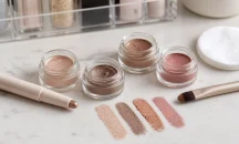
Cream formulas can create a quick metallic or satin lid but vary in dry-down and transfer. Apply a thin layer, blend edges before it sets, and add opacity only after assessing the first coat. The cream eyeshadow tutorial covers finger, brush, and layering methods.
Do not share pot products or dip an unclean finger repeatedly. Close the package promptly and stop using a formula that changes smell, texture, or performance.
Keep eye-area products and tools hygienic
The FDA’s eye cosmetic safety guidance advises clean hands and applicators, not sharing eye cosmetics, and avoiding eye makeup when the eye is inflamed. Do not add water or saliva to revive shadow or liner.
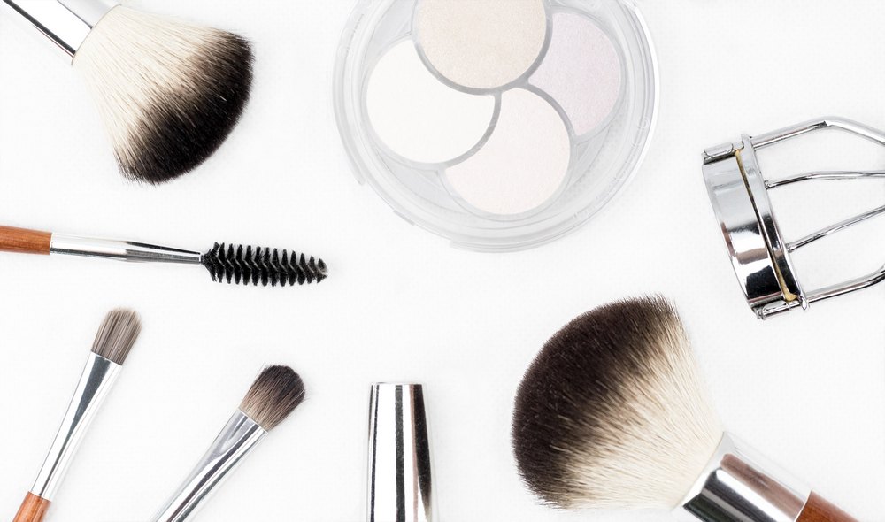
Tap excess powder from brushes before bringing them near the eye. Use a clean tool for each wet or cream product and wash reusable brushes appropriately.
Test the look in more than one light
Check daylight, indoor warm light, and the lighting used for the event or photograph. Copper can appear orange under warm bulbs, while purple may read gray in dim light. Adjust saturation, not just color family.
Take one photograph from normal distance. Close-up eye images can overstate small differences and encourage unnecessary layering.
Coordinate with clothing only after the eye look works on its own. A green top can make green iris tones seem stronger even when the shadow is unchanged. Record the complete setting if photographs are being used to compare color effects.
Build a small hazel-eye capsule palette
A practical set can include one matte taupe, one warm brown, one plum, one bronze or copper, and one light satin. Those five roles support contrast, warmth, neutral structure, and highlight without requiring a large palette whose duplicate shades are difficult to evaluate.
Choose formulas by usable texture and eye-area labeling, not by the number of pans. A compact palette is valuable only when each shade has a distinct role.
Remove shadow without rubbing the eye
Use a remover compatible with powder, cream, waterproof liner, and any adhesive. Hold the product in contact for the directed interval, then wipe gently with a clean surface. Remove glitter particles without dragging them across the eye.
Persistent pain, redness, swelling, discharge, light sensitivity, or vision change needs appropriate eye-care assessment. The FDA’s general makeup information provides broader label context.
Hazel-eye shadow checklist
- The desired effect is green contrast, gold emphasis, harmony, or neutral depth.
- Hue, value, and finish are planned separately.
- Placement is mapped with eyes open.
- Every formula and glitter is labeled for the eye area.
- Tools are clean and products are not shared or diluted.
- The result is checked in realistic lighting and removed gently.